
Every year the good people of Drawger gather together to deliver a yearly annual.
I'm inclined to say that 2010 is the best ever.
Thanks a million, two hundred thousand to Ellen Weinstein for the poster image.
Hope you enjoy the show!

Every year the good people of Drawger gather together to deliver a yearly annual.
I'm inclined to say that 2010 is the best ever.
Thanks a million, two hundred thousand to Ellen Weinstein for the poster image.
Hope you enjoy the show!
As many here now know, Drawger is going to get smaller over the course of the coming year.
This decision on my part went into effect last week and Zina Saunders just happened to be the first one on a rather long list of people who will no longer be blogging from Drawger.com.
I very much like Zina personally and I'm pretty darn sure she knows that. At least, I hope she does. If Drawger survives this change, the same sentiment towards Zina applies to everyone who will no longer be blogging from here as the coming year lurches forward.
The "it's not personal" sentiment above. That's lame. I wish there was another option to express how I feel. I can't think of one. Drawger needing to get smaller is entirely my fault. Drawger being too large right now, all my fault.
What's actually happening. When a member's yearly subscription expires, each person who's moving on will have five days in which to have their say. If people feel the need to call me a rat bastard, they'll have the soap box to loudly do so. I think it's right that people be given the opportunity to say whatever they need to say about the changes taking place here. If you're moving on and think I'm a rat bastard, post it.
The me thing. I do not manage Drawger in the hopes of making a name for myself or to gather accolades. I also do not manage Drawger to make money, because it doesn't make any. More obviously, I don't manage Drawger to make friends or influence people. Consequently, I usually stay quiet in the background most of the time. The actions I am taking however do land me front and center in what is certainly a controversy. Pitchforks at the gate, the town on fire, looks bad, perhaps it's the end.
The controversy itself, the town on fire, pitchforks, they don't make me uncomfortable. Being in the spotlight does. I don't like spotlights, never have. Here I am in it and very uncomfortable. Alright then.
Here's where I'm at. Drawger has too many members for it to be enjoyed in the way that I originally designed it to be enjoyed. There are so many people here that remarkable articles, thoughtful insights and downright genius are only on our home page for a day, before they are pushed off by other articles and quickly evaporated from view.
When insightful, topical and thoughtful articles quickly disappear from view, there is clearly less incentive for members to invest the time and energy necessary to create those insightful posts.Why bother if all that hard work and thought is going to be gone from view in a day?
The result of over-population? Less cool stuff to read and look at.
Back to the rat bastard thing. Perhaps saying that about me would be just the thing, or perhaps a bit harsh. I think it would be more fair to say that I have managed Drawger very poorly. That rings true. That would be abundantly fair. For failed management, I take all responsibility. If people want to call me out for being a poor manager, I'll gladly hand you the rocks to throw. I've allowed Drawger to get too big and too big just sucks. All my fault. I'll hand you bigger rocks and let you stand as close as you want on that one.
My original vision for Drawger was that it would be a very small, private social club. For a couple of years, it was exactly that. I woke up every morning energized and excited. Drawger was my home away from home. Somewhere along the line, I let that original vision slip away. The small social club transformed into a over-crowded dance hall. Because I wasn't paying attention. You bet.
The result of over-population? I showed up to read stuff less often. I woke up bummed out every single day.
The changes taking place here at Drawger are, admittedly, all about my personal happiness. It's all about being horribly selfish and dreadfully self-centered. I do not want to wake up every day feeling the way I've been feeling. I want that small social club back, I need the original vision of Drawger returned.
I'm not going to talk about the criteria for how my decisions are made. I have made this site available to my friends with no expectation of reward, except the personal reward I receive when I get to read and see remarkable works and words. With that said, I'll get back to my place in the background. Take aim and fire away as you see fit.

Every year, illoz.com sponsors a baseball team with WNC Fall Ball. This year, we're sponsoring a T-Ball team, The Mudcats!
For those of you unfamiliar with the wonders of T-Ball, it's for ages four through seven. Players have the option of the coach pitching to them, or hitting from a tee (a little stand that holds the ball for them).
I've been around youth baseball for almost twenty years and T-Ball is by far my game of choice. In the first Mudcat game of the season, one player ran to his mom after getting a hit, another player chased the ball into the outfield after hitting it and proceeded to wrestle with the outfielder who had the ball, and a third ran directly to second base after getting a hit. I'm telling you what, there's nothing like it.
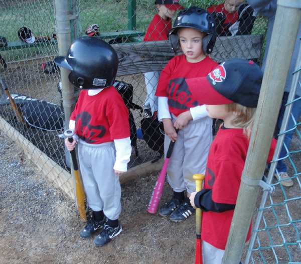
Mudcats, waiting for their turn at bat! Go Mudcats!

There's a creek behind the dugout and for Mudcats, this is the place to be between innings. Here's a few of the star players preparing to clamber through the bushes to look for salamanders.
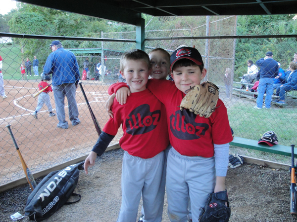
The Mudcats are team players, I tell ya! Yeah Mudcats!
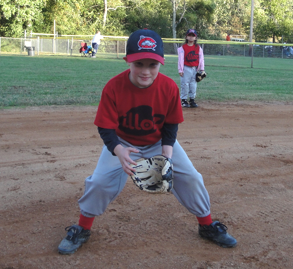
This is one serious Mudcat! Not!
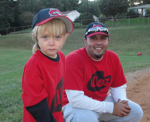
I'd like to thank Jermaine Parker for coaching the team! This guy really knows what the meaning of "play" is. A lot of coaches tend to forget what that word actually means to kids.
Past seasons: 2009 illoz Orioles and the 2008 illoz Angels
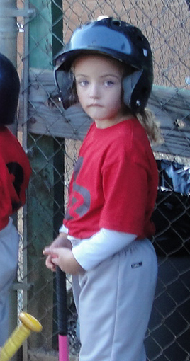
Oh and one more thing: Pink bats are cool! Go get em girl! Test Link.
I LOVE work surfaces (where the mysterious magic happens) and was lucky enough to snap a few during a recent trip to NYC. Figured I'd share these, for anybody who feels the same as me. Give it up for the work surface, yo!
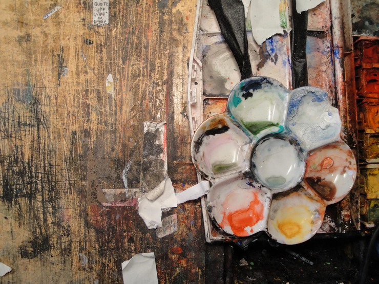
Steve Broder's work table above. Forty years of hard labor and mad mad love in grisly detail.
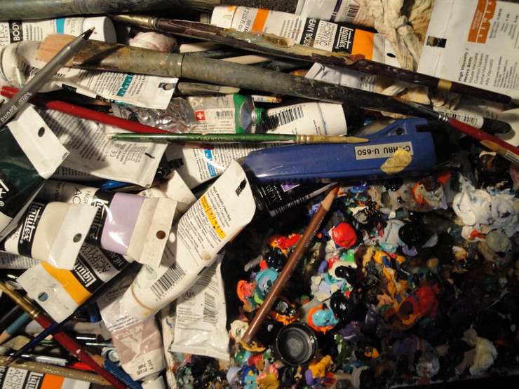
Detail of Brad Holland's chaotic and at the same time serene work area, pictured above. The piece he was working on at the time (inches away from what you see here) was everything you'd expect from the MAN, and then something more, but you don't get to see that.
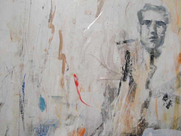
Tim O'Brien works standing and as such, his board is as straight-up and verticle as the man himself. Here's a small, yet subline detail of his large working surface at the time of my visit. What else do you want to know? BAM!

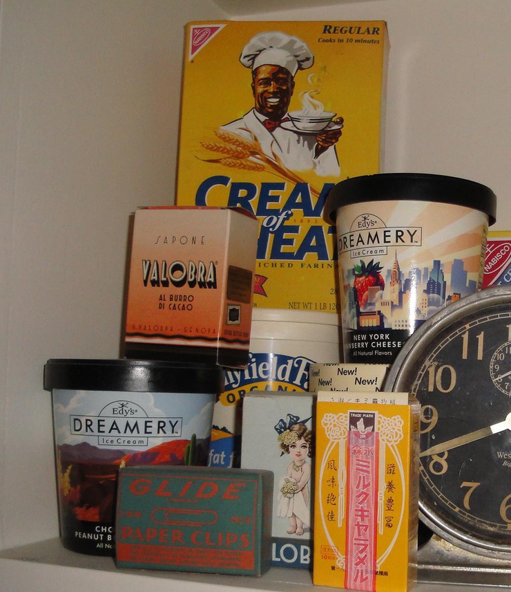
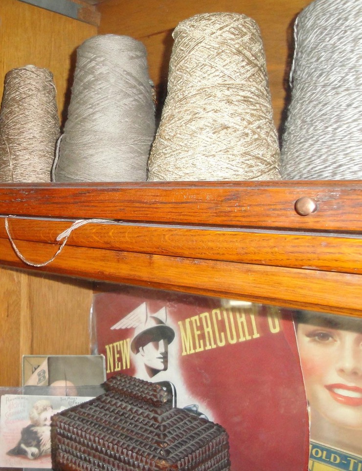
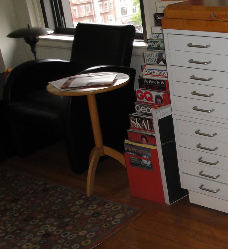
Nancy Stahl invited me to visit her home and studio during a recent trip to New York. I asked if I could take a few snap shots and luckily she didn't mind. Obviously I'm not a professional photographer, but I think these amatuer pics provide a partial glimpse into how this remarkable woman is able to stay vital, current and simply bad ass by surrounding herself with inspiration.
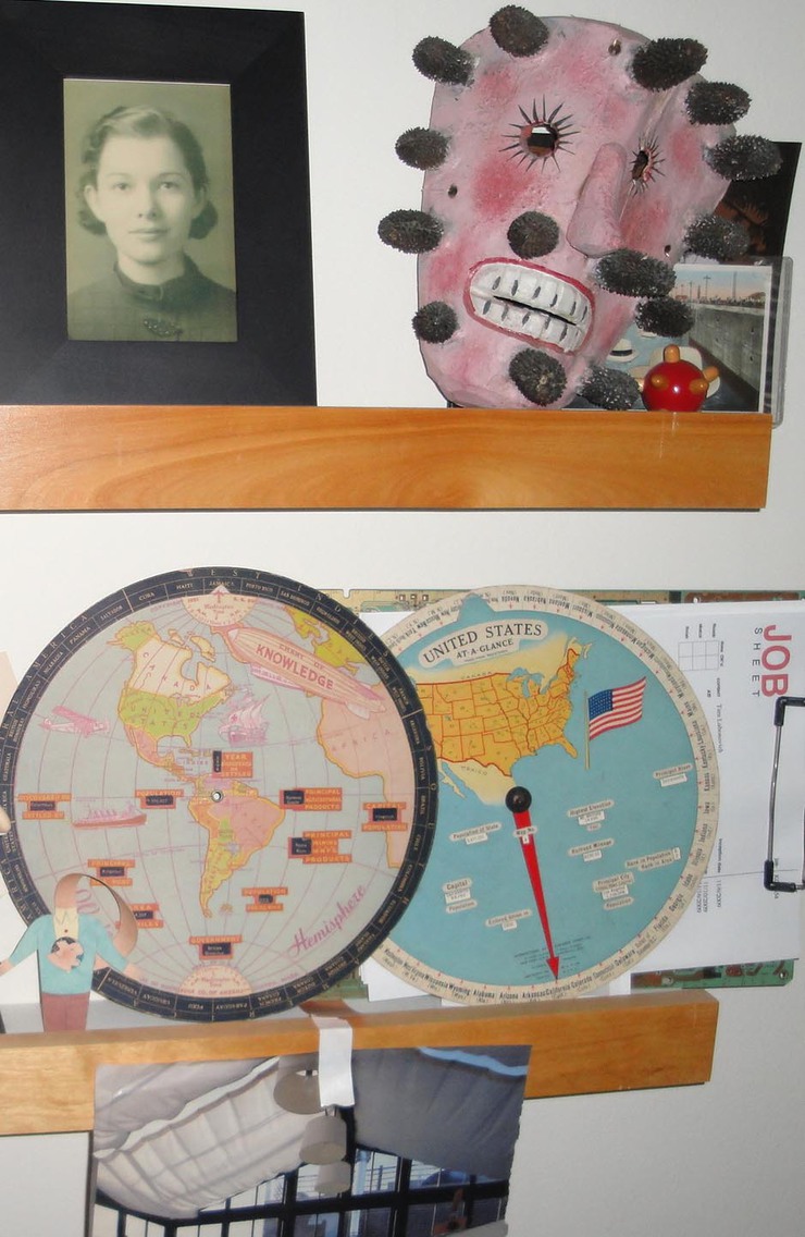
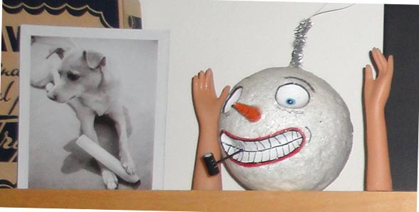
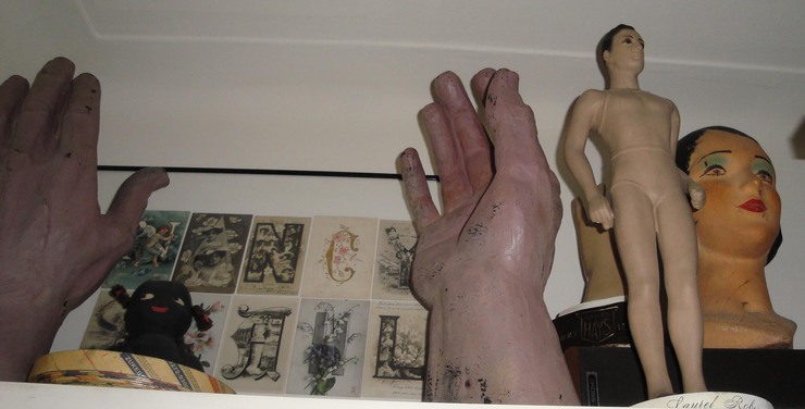

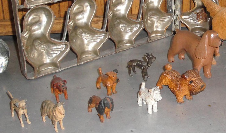

Thanks much for the hospitality, Nancy!
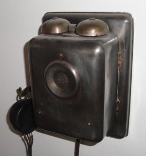
I wonder if I call you if this thing (left) rings. I certainly hope so!
There's no way that I could show everything Nancy surrounds her life with - just a wee little glimpse is all I can show here. Her space is remarkable and I walked away feeling that at every turn of the head, she's challenging herself to constantly move forward.
The work of Drawgers Leo Espinosa and Edel Rodriguez were spotted at the Asheville Art Museum (which is the nice little museum in my nice little town). I only happened upon this by chance, as I was wandering through the galleries last night looking for the musical ensemble Barbez, who were to put on a night of fine entertainment in one of the museum galleries.
Looking for where the music was to take place, I paused to admire a rather handsome Chuck Close that I'd never seen before, lingered on a little gem by Thomas Eakins for quite a while, turned the corner and spotted an Eric Carle....
I thought, what's this? Illustration? Pressing further into the gallery, I spy several pieces by Art Spiegelman and realize that I'm was on to something quite unusual for an art museum. Hadn't I just been looking at a Leonard Baskin and a John Singer Sargent? I'd rather look at illustrations any day!
Then, I look to one side and it's Edel Rodriguez! Oh Sweet Happiness! Turning around to face the opposing wall, it's Leo Espinosa! Joy compounded! My friends, in a MUSEUM! They looked right at home.
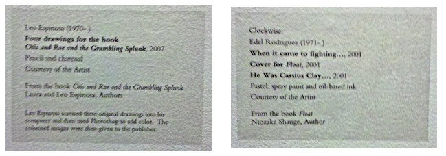
Really bad pictures of the stickers on the wall. I didn't want to draw any attention to myself by using a flash, because as you may know, taking photos in a museum is strictly forbidden!
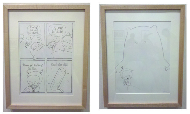
And yes, I violated museum policy by taking a couple of quick snaps of the pieces by Leo! Somebody call the police!
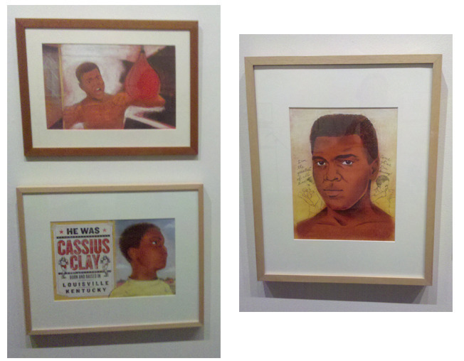
And more unlawful activity quickly followed with really bad photos of work by Edel! I'm an outlaw!
------
Here's a link to the show, which is called Nouns: Children’s Book Artists Look at People, Places and Things.

Got sleep? National Geographic gave us the call recently to program an online survey based on just that question. One week deadline!
What NatGeo wanted: Ten illustrated questions. Four possible answers for each question. Four final results based on how the ten questions were answered. Finally, choose one of four faces that you post to Facebook.
Here's a link to the final result.
For this assignment, I had to pull out some dusty illustration skills (such as they are), which I hadn't put to use in nearly nine years. While struggling with the doodles for this interactive, it occured to me that what I'd really like to be doing is collaborating with a real illustrator to make this project really pop. It's something to think about for the next interactive we're asked to do. Cool javascript written right here, illustrations from somebody that really makes the final project solid.
Details for Dorks
In the past, we did interactives such as this exclusively in Flash. For this one, we programmed the entire interactive in javascript and for certain, this will be the way we handle these sorts of projects going forward. It was faster to deploy, and at the end of the day, it looks better than having to rely on a Flash player. Not only that, it runs on hand-held devices, which Flash currently can not.
Getting our final code delivered to the National Geographic server provided an interesting look under the hood of this major site, which AdWeek recently named as website of the year. We were provided with access to the NatGeo CMS (content management system), which allowed us to simply paste our full code straight into a text field, save and then view. Having designed and delivered CMS systems for the last nine years or so, it wasn't exactly the most intuative or elegant interface, but at the end of the day, it worked and that's all that really matters, one supposes...
It was also a fine thing indeed to team up with Rob Covey again. Rob is heading up online creative for NatGeo these days. Back in the day, Rob made working with US News and World Report a real gas and at NatGeo, he's still making every project a real pleasure.
In January of 2006, I had this odd notion that a site where illustrators posted articles might be a fun place to hang out. At the very least it sounded like a place where I'd like to hang out.
Somehow or another, I got a few other people to think it might be fun as well. Dave Bamundo, Randall Enos, David Gothard, Don Kilpatrick, Mark Matcho, Hal Mayforth, Robert Saunders, Michael Sloan, James Steinberg, Nancy Stahl and Steve Wacksman were all willing to listen to this rather peculiar idea.
Around 2:30pm, February 9th 2006, Dave Bamundo bravely clicked a save button where no man had clicked a save button before and just like that, Drawger was born. About an hour later, Mark Matcho wandered in, clicked on a comment link and typed a few sentences. The first comment arrived.
The following day Randall Enos published the second article here at Drawger.
On Drawger's forth birthday, there are 7,632 articles here and 82,295 comments. Image galleries here contain over 10,000 things to wonder at. Getting Drawger started, I have to admit, it was a rather selfish thing for me at the time. I just wanted it for me, me me. Remarkably, it's now for thousands daily, because of everyone here.

A few memorable milestones (for me)

September 11th, 2006 - The homepage became a spontanious memorial. Without a doubt, one of the most moving experiences I've ever had. I realized then that Drawger was much more than fun, it was deeply meaningful. Sample of that day, from Edel
Monkey Song - October 2006. A completely blank post by David Flaherty got 151 comments. I try to derive meaning from this, but never arrive at any.
November 2006 - Enos published his first My Life on the Slanted Board. I hoped there would be more. There are.
January 2007 I notice a very real spike in traffic and wonder what's going on. I track the traffic back to a rather obscure, politically right-leaning site. The reason people were showing up here? To convince themselves that the "artistic intelligenicia" were suffering from Bush Derangement Syndrome. It suddenly dawned on me that Drawger was having an impact. Until then, I thought we were all here just talking to each other. We got 50,000 unique visitors that month. 50,000 visitors is often a daily occurance here now.
September 2007 - Drawger is officially on radar as sites like BoingBoing (here linking to a Nancy Stahl show) and others start to take notice that something might actually be going on here.
June 2008 - Note to self: The most popular content at Drawger is Lou Brooks' Museum of Forgotten Art Supplies, with over 375,000 unique page views for the week.
July 2008 - Barry Blitt's New Yorker cover, titled "The Politics of Fear" just about crashes the server as thousands arrive hourly to send him hate mail (pro-Obama hate mail), even though his page here has nothing on it at the time. Fortunately for Barry who wasn't even able to eat solid food at that point, his email box was full and all that stupid crap bounced back to Drawger.
June 2009 - The New York Times refers to Drawger in print and then online, regarding Google's requests for free art in exchange for links. After getting an average of 10,000 hits per minute, Drawger goes down hard and we get a new server.
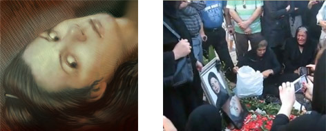
July 2009, Tim O'Brien posts Eyes, a portrait trubute to Neda Agha-Soltan. Visitors from around the world arrive by the thousands, we're linked to by sites I can't read. The portrait is displayed at her memorial service.
This is an amazing place to call home
A good neighborhood is made up of people who you learn to know and love, where you don't mind the guy next door throwing a trash can in the street at 2am, where your neighbor is willing to help you jump-start your car when it's 10 degrees outside, and where you don't have to lock your doors. To me, that's Drawger.
Happy birthday Drawger! I love you!
I was on the phone with Enos yesterday and we were chatting about his days at the Famous Artists School. The talk inspired me to rummage around in my garage and pull out some of the course books I've collected from the school. If you've never seen one of these, they are large (14 X12) and impressive items. The ones I have are from 1959.
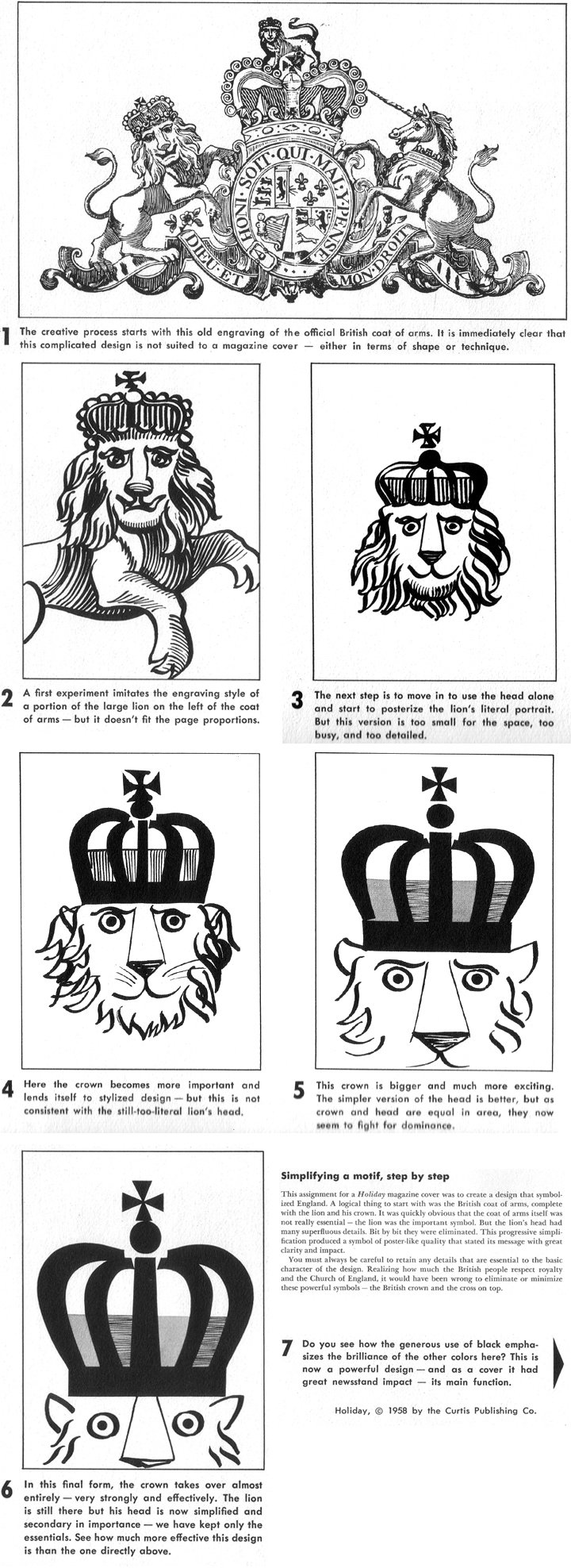
I haven't thumbed through these in many years, but once I started, these was no stopping. One of the books, blue cover, Lesson 18, titled Principals of Experimental Design contained a lesson designed by the great George Giusti, which I thought I'd share with everyone.


Other Giusti Resources:
Covers collected Alexander Budnitz
RIT Library
And I've set up an album for Giusti right here that I'll be adding to!
Also:
The collected stories of Enos at the FAS
Re-evaluate long-term relationship with Georgia and Times New Roman
Reject Pantones 2010 color picks, especially turquoise
Just surrender to Google Reader, they own RSS... for now
Reduce complications by puchasing black socks only
Reconsider #CCCCCC and seriously consider #AEB3B7
Deal boldly with line-spacing without fear of rejection
Decide once and for all that Lil Wayne is simply the best and just be done with it
Nail down the actual answers to what I wonder about
Get Bob Staake back here where he is loved the very mostest
Get Drawger displaying better on mobile devices
Create more lists