ZIMM
Complaining

My CMYK Birthday Present

MARCH 18, 2011

March 7th, CMYK Magazine #49 went to newstands as some sort cruel birthday gift for me. The editors decided to subject their readers to illustrations (if you can even call them that) I happened to have banged out when I was still doodling for dollars, back in the before-time, before the continents had drifted apart, before the ice receeded to the poles. Without my permission, even. Imagine that. 'Oh, here's a hack job that Zimm did for Mountain Dew that was obviously done under extreme duress because he simply needed some cash and didn't care where it came from. Let's print that! Wait, wait, here's a stunningly meaningless turd that Zimm did on a hangover for the 'Got Milk' campaign. Print it? Heck yeah! Ask his permission? Why bother!' Imagine the joy in the seeing these reminders of hackery and despair in print once again. Thanks CMYK! I usally hate my birthday anyway!

Where did CMYK find these forlorn relics, these dried-up left-overs from the salad days of illustration (people would buy anything back then, I tell ya)? On my largely forgotten website that even I haven't looked at or updated since the internet was discovered. A cruel reminder to all you people who haven't updated your sites in years. Just keep in mind, somebody might actually publish that crap without even asking!

Backstory: Ronald J. Cala wrote me an email some time back to inquire if I would write something for the magazine. I wrote it, sent it in, decided I  hated it, then asked that it not be published. Well, truth be told, I told Ronald J. that I didn't like what I wrote when I happend upon him at this years' AI Party, so he probably forgot. It's the only thing I remember distinctly from that night, so I know these things happen.

Happily: My article, along with the editors largely mis-informed (who the heck has time to call and get it right these days?) introduction, is sandwiched between articles featuring Scott Bakal and Yuko Shimizo. It was nice seeing my friends, at least!


permalink | comment
Topical: Complaining  Seen  

10 Things I Wonder About Illustration Marketing for 2010

DECEMBER 29, 2009

1. I wonder if source books work any more.

2. I wonder if direct mail works any more.

3. I wonder what reps do these days.

4. I wonder if social networking brings home any cabbage.

5. I wonder if big portfolio sites like theispot and folioplanet deliver a return on the investment.

6. I wonder if blogging pays.

7. I wonder if dropping off a portfolio actually exists any more.

8. I wonder if winning awards still means anything.

9. I wonder if just sticking with it still works.

10. I wonder if it's even possible to answer any of the things I wonder about.


Play Ball!

OCTOBER 20, 2008
the illoz Angels

Why is it that kids baseball team photos are all the same?

The photographer lines everyone up according to height so that the photograph is nice and symetrical. Everyone is instructed to put their hands behind them or at their sides. Face forward.... look like winners....and  snap, that's your memory. A solumn line-up of kids who signed up to have a good time and play a great game in the sun.

I've been involved with youth baseball for over 15 years now and year after year as the teams line up for their generic photos, I've often wondered, why so serious? For me, baseball is about having fun - and when I say "fun", I really do mean exacty that.

Most coaches insist that it's all about having a good time. In fact, they will repeat it over and over again. Have fun! But the truth is, when the game is on the field there are very few who actually deliver on their promise. Parents rarely help either. They scream from the bleachers, not with joy, but about the missed call or the missed opportunity.

By far, the largest group in youth baseball is the very young. Players from ages four to eight outnumber players at age eleven by double. By age thirteen, the number of players is only a tenth of those who started at age six. Why do the stop playing? They stop because they thought the word "play" actually meant it was about having fun. It turned out to be exactly the opposite.

Sadly, team photos are very often a snapshot of broken promises. I see it year after year.

But, I'm not willing to give up! I'll be back next season with the same crazy notion that this game really is about having a good time. Perhaps I'm delusional, so be it. Play Ball kids!


Illustration Forward

DECEMBER 15, 2006
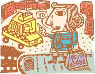
It's no secret that print editorial, faced with a lot of entertaining competitors, is losing market. When the topic comes up, my suggestion for regaining momentum is simple. Offer something that no other medium can deliver as effectively: remarkable illustration paired with outstanding writing. Make it a product people really want to look at first, then seal the deal with compelling content. My concerns for print have mostly dwelled on a lack of foresight on the part of editorial management. Instead of more art, I see less. Instead of better content, it seems to get worse. Poignant art as a necessary ingredient for catching eyeballs, starting conversations and staying competitive and relevant in a changing world doesn't seem to have many buyers. Why is this the case? To me, it seems fairly simple. If you want to compete, do what you do best. It's easy to lay blame at the doormat of lack-luster and unimaginative management. They're a big target and easy to hit. But, there's plenty of blame to spread around. Imagine if some of it falls squarely at the feet of the illustration community, itself. I started imagining that recently and it wasn't a fun exercise. 
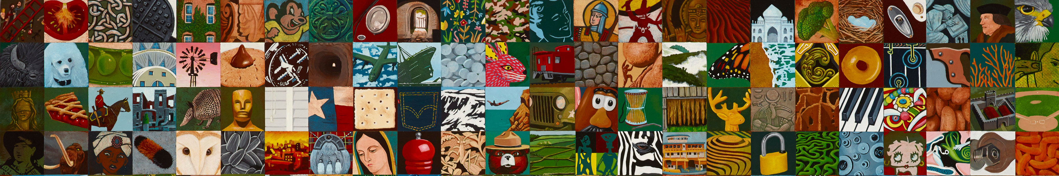
Anyone involved in the commercial illustration boom of the 1980's and 90's will fondly recall those salad days of cash and plenty. They were good times, but good times can breed complacency. The world of entertainment has changed dramatically, while you could argue that the basic assumptions about what illustration should deliver to an audience has stayed fundamentally the same. Illustration can still offer decoration, of course, but the demands for interpreting hard editorial content with skill and insight should be on the rise. I don't see that happening. Perhaps I'm expecting too much? I see more of the same salad day reruns. A good example of rising editorial standards is Forbes Magazine. Forbes, as anyone in the illustration racket knows, has been a long-time supporter of great illustration. They've used it well and in abundance. At the same time, Forbes has also consistently contributed hard-hitting and provocative editorial views. They remain a class act. The quality of journalism in Forbes has risen and in that regard they seem to be meeting the challenge of a new world. I look forward to it arriving. When Forbes exposes corporate corruption, poor practices and outright fraud, they often turn to the best illustrators in the business to help them tell the story. Their instincts are right. Illustrations should be able to aid this type of important content. As I was doing a casual browse through the last year in print for Forbes however, I was disappointed in the art. I didn't find even one example where the art came close to hitting as hard as the content. It was an unsettling realization for me. I say this knowing full-well that I am referring to the hard work of esteemed colleagues that I both know and admire. So, I'm a cruel SOB. I will loose friends. I don't care.
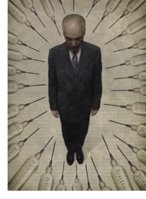
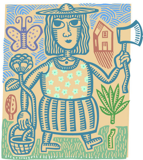
Matt Mahurin for Forbes
Here's an example of where I'm at, and I'm using an illustration that I personally thought was one of the best that Forbes commissioned this year. In the October 30, 2006 issue, Forbes took a brutal look inside Emgen, a biotech sector business that supplies life-saving and vitally needed medications for cancer patients. Forbes pulled no punches - they exposed a corporate climate that is genuinely creepy and quite likely corrupt. The article stuck with me for weeks and it started a lot of conversations for me. Forbes commissioned Matt Mahurin for a full page to accompany the remarkable story. Mahurin, as many will agree, is a long time professional and well regarded for good reasons. His illustration solution? A bunch of needles, wonderfully executed, pointing accusingly at the CEO of Emgen. It had every single element that I would normally enjoy: High concept, arresting composition, limited palette and very well executed in a unique voice. It had everything. Yet, for some reason I wasn't satisfied in the same way that I used to be satisfied. I wanted more.
The article itself was a huge conversation starter for Forbes. Why couldn't the illustration do exactly the same? Am I expecting too much? I hope I am not expecting too much. I'm a consumer. I just want a better product than the one that satisfied me in the 1990's. If they're smart (and I think they are) Forbes is asking themselves how the art they commission is doing anything more than decorating their pages at this point. I think it's important for illustrators to have that same conversation, as well. The articles themselves often have enormous impact, they start important conversations and actually move markets. Why can't the illustration contribute to the same conversations? They should, but right now they don't. I put all this out there as a consumer only. I'm not a critic. I don't have a masters degree in anything. I don't ever want to sit on a panel of judges. Perhaps I'm just a crabby and unsatisfiable consumer that should be ignored. I can live with that. Editorial print will survive, I'm convinced. I also believe that illustrators need to be an important ingredient for survival and growth. How that happens, I'm not sure. With that said, I honestly detest people who raise concerns without having a viable way forward.
permalink | comment
Topical: Complaining  

The Great Vegan Cookie Guy Rip Off

MARCH 30, 2006
not zimm
I get asked a lot if I was the guy who did the packaging illustration for The Alternative Baking Company and their popular line of vegan cookies. The answer is no, I did not. The cookies first appeared in small numbers about ten years ago and I glumly noted the rather blatant appropriation of my illustration style being used as the face of their product line. I never attempted any legal action (not much one can do in a case where the rip-off artist isn't ripping you off exactly). I did write a note to the owner at the time, telling him that if he ever wanted the real thing, he should call me. He never did. I also never learned who actually drew it. The fellow that started the company is also a vegan children's book author and apparently runs with a posy of vegan illustrators, so maybe one of them did it.
zimm
A longer than necessary foot-note to this... I'm well aware of my own artistic limitations, but never-the-less, I was able to carve out a little nitch for myself with a unique enough look that people could recognize it when they saw it. Overly bold outlines always, spiked zig-zag hair often employed, scratch board artifacts left in place, very often a triangle nose in the early days, and evenly spaced hatch marks to vaguely indicate shadow areas - these continue to be staples of the what I do and what art directors learned to expect. Happily, even art directors who have asked me about the Alternative Baking Company logo illustration seem to already know that I didn't do it - or if I did, I was having a really bad day. "It's a rather sad imitation of what you do", they always say, consolingly. The downside of this for me is that in the world of branding and packaging, a certain style only has so much currency to spend before it runs itself out. Brands require unique identities and when that identify is a style that is unique enough, it's good for the brand, and other brand managers take note of that. One can't have a product "look" that is similar to another. Each brand, to be successful, has to have their own unique identity. So, what the Alternative Baking Company did to me, by appropriating the look and feel I had created for myself, was to categorically lock me out of product packaging illustration, grocery store shelves in particular. I can tell you the downside described above is not just theoretical either. For years I did many illustrations for the American Dairy Association - in store displays were common, collateral in-store give-aways and a bit of packaging, all containing my peculiar brand of drawing. As soon as the Vegan Cookie Guy got wide distribution, I was told flat-out by the art director that I was done with the Dairy account. Vegan and dairy , ya know. It didn't matter that I hadn't actually done it, the client recognized the style, promoting, shall we say, "a diametrically opposite world-view" and I was promptly shown the door. What other opportunities I have missed because of the Vegan Cookie Guy, I shall never know.
permalink | comment
Topical: Complaining  

Rejected Experiments

MARCH 18, 2006
Some time ago I was trying out a variation on what I usually do - not all THAT different from my regular fare - but never the less, rejected far and wide by art directors. I like the look myself, but getting completely hammered with complaints shut this stuff down mighty fast. Oh well - I'm posting these up here anyway as a reminder that change isn't always for the best, I suppose.
Totallly shot down in a ball of flames, but I like it anyway, so there.
Rejected out of hand and sent into illustration exile.

. . . . .
permalink | comment
Topical: Complaining  

Play (whatever)

FEBRUARY 15, 2006
Boo!
The Play Illlustration Source Book from Serbin was supposed to promote people who design interactive games, design for games, stuff like that. I do that kind of stuff for money these days, so I thought I'd buy a page.

Today, Play Illustration launched it's website, which is unfortunately just another online mishmash of jumbled confusion that allegedly does good things for folks like me. What I got is basically an unfindable page among hundreds of others that I can't control, can't make the way I want, can't actually run the games I'm designing on, and basically just sucks large. Reality check: I know I can't draw that good but in the big scheme of things I can at least entertain folks for a spell

The first on the scene with online illustrator promoting, as far as I recall was theispot.com, from the amazing Gerald Rapp. I like Gerald - I'm down with the guy because he's cool and I dig him, but when he showed me theispot.com I said "This is lame" - "it's a jumbled ball of confusion" and I thought to myself those many years ago, that there has to be a better way for illustrators to get a message out online in a way that doesn't suck. Lots of time has passed and theispot still seems to be the standard - Click a whole bunch of check boxes, like humor, animals, children, and you get a few hundred talents to browse through. Not only do these various online talent systems seem screwed up, they ain't cheap either. They're making serious dollars and what do they deliver? I'm not sure...

I tried out portfolios.com (sexy animated chick on the homepage probably got me...) - but it delivers zero traffic to my site - the search at portfolios.com is the same as Gerald Rapp created at theispot in the late 90's - click a bunch of boxes and get several hundred results to browse through.

I have a feeling it doesn't have to be this way, but I'll also admit that I'm not sure what the best answer is yet. One online high note is the amazing blog at drawn.ca - comes up at number five in a Google for Illustration search and maybe there's an answer there... somewhere.. . . . .
permalink | comment
Topical: Complaining  

The Amazing Shrinking Illustrator Credit

FEBRUARY 10, 2006
This is same size

Okay, I know I don't see as good as I used to, but I'm convinced that illustrator credits are getting smaller and smaller.

I measured this one from US News and World Report and it was 3.5 point type, crediting the talented David Gall.
200 % view
Here it to the right at 200%.

I don't know, maybe I'm just suffering from old age and general crabbiness...

. . . . .
permalink | comment
Topical: Complaining