ZIMM

2007

Vintage Commercials

DECEMBER 21, 2007
Citgo Commercial
I had a job sweeping the floors at WSOC TV in Charlotte, NC in 1972. One day a guy handed me a huge box of commercials on 16mm tape that were on their way to the trash-bin. He gave them to me because I was "an art guy" (at age 13), and would somehow "know what to do with them one day" or, so he insisted at the time.

I carried around that box of commercials for almost 40 years storing them in hot attics and damp basements along the way. Last year, I found somebody to digitize them.
Talking Crissy
Even though these vintage commercials have faded and sadly lost a lot of color with the passing of time, I've decided to share them with everyone, regardless. Some of them are simply gems.

The whole project is here at YouTube.
Some of my personal favorites

The Car Man - Citgo Commercial
This one is just a pure classic from start to finish. I wonder who that girl is. There is another in the same series here.

Talking Crissy Doll
This commercial might be one of the creepiest things I've ever seen. One of the girls who starred in this actually wrote to me and said she thought it was creepy too.

 M&M's - Go Fish
 This one is just great television. I kinda wish there were more commercials like this.

GumBall Banks
"Thanks for the GumBall!"

Country Club Malt Liquor
They could never make a commercial like this today. Features a room full of drunks drinking a lot of beer. I love it.

 Del Monte Gel Cup
This commercial is perfect. The timing, the kid, everything.

Belly Button Baby
This means something and I'm not sure I want to know what it is. If you figure it out, keep it to yourself.

Close N'Play by Kenner
I can watch this over and over again.

--------
permalink | comment
Topical: Seen  

illogator

DECEMBER 11, 2007

I'm very pleased and proud to release illogator.com for the perusal and pleasure of the illustration collecting public.

The illogator is designed specifically for illustrators who are selling original works, whether they be original paintings, prints, objects of desire for the home, or unique apparel items. Online shops at illogator are available to illustrators by invitation only.

My personal hope is that illogator's primary contribution will be to give art collectors a place to purchase original works that they have seen on book covers, magazines and other print mediums. The art from the cover of Time Magazine, the art from the cover of a latest best seller, the art on the annual report from IBM - these are arguably more influential to our culture than any works that hang in our museums on any given day. I'm pleased to be able to trumpet that notion and to provide a website where those original works can be made available for purchase.

The world of illustration has changed dramatically over the past decade. More and more, illustrators offer their own lines of unique merchandise and illogator.com provides professionals with a place to sell and promote those lines as well.

The site launches today, with a small group of  remarkable people who have helped me test out the site and make this idea come to life. I'm very grateful for all their efforts on behalf of this project and hope it serves them well for very many years to come.

go there
permalink | comment
Topical: At Drawger  Props  

Drawger Annual

NOVEMBER 19, 2007
Very pleased indeed to let loose the 2nd Drawger Annual. The first one in 2006 was so much fun, it was clear that Drawger should give it another go. 52 Drawgers made it happen for 2007. You learn a few things putting together a show like this. One is that illustrators can't do anything without a deadline. When I sent word that the show was being planned, I gave Drawgers a somewhat generous deadline for entries of about a month and a half. With almost no exceptions, every single piece arrived on the last day. So rule number one when dealing with illustrators: Deadlines rule. Another thing. By and large illustrators have weird names. I defy anyone to spell Burckhardt the same way twice or Vasconcelos, Witschonke or Ciardello. I have unresolved spelling issues, and putting this together required cut-and-paste skills like I've never employed them before. For some reason, I had Brian Stauffer's name spelled three different ways on the same page at one point. He was kind enough to help me through that. New admiration goes out for all those art directors setting illustrator names in 4 point type for the margins of magazines. I've never seen one spelled incorrectly. Third and lastly, illustrators are an amazingly generous lot. If you ask them nicely and have even a measure of sincerity, they will bend over three ways to Sunday to make good things happen. The 2007 Drawger Annual is testimony to that. The show was a real pleasure to have all to myself for a while. It was like sitting alone with an unreleased classic. I've looked at each individual entry dozens of times - some of the works were much larger, with much higher resolution than I can display at Drawger, so I had the benefit of zooming in, for what I must admit to as many hours spent marveling at the skills and dedication to the art form these great people have in bewildering abundance. I hope everyone enjoys the show! If we can keep good ship Drawger afloat, we'll do it all again in 2008.
permalink | comment
Topical: At Drawger  

Server Tsunami

OCTOBER 11, 2007
The Drawger server suffered a big-thumb catastrophe last night at around 11pm. Five days of data was deleted in less than five seconds. The data can not be recovered - meaning that a slice of Drawger history is lost forever to the digital beyond. I am humbled, embarrassed, and terribly sorry. In the eight years I've dedicated to developing internet technologies, I've never experienced anything like this. It's a server tsunami. Here's part of the disaster back-story: I've been scrambling lately to cope with unexpected popularity at Drawger. Over the last 30 days, we've been visited by over 65,000 people who have eagerly gobbled up over 366,000 pages of content. Since Drawger was originally built as a small social club, we simply didn't have enough capacity to accommodate all the guests. If Drawger was a bar, the fire marshall would have closed the joint down a long time ago. Not enough chairs, not enough bathrooms, not enough emergency exits for the gregarious crowd. So - last week we packed up and moved to what appeared to be a bigger, better ventilated box. What we didn't realize was that the sprinkler system didn't work and all the emergency exits emptied out into oncoming traffic. What looked like a good move turned into a disaster waiting to happen - and it did. Hopefully, the members and guests will forgive me. I am taking steps to insure this can never happen again, at least not on such a massive and disastrous scale. Right now, we have temporary lodging in the server-equivalent of a bunch of FEMA trailers. By this weekend, we will be high, dry and living the good life - I promise.
permalink | comment
Topical: At Drawger  

illo to web VER. 1.0

JULY 28, 2007
If Business Week is right and the days of the print edition of the San Francisco Chronicle are numbered, it probably means that a lot of other major regional dailies will fall right behind them.

If it's an inevitable truth that the daily news we read will soon only be found behind the smudged screens of our iphones and laptops, it might be time to start wondering how illustration follows along.

So far, no one seems to have figured this out, at least not in a way that makes much sense.

Here's an example of The Chronicle using a Joseph Fielder illustration, taken from print and brutalized with extreme prejudice for the web edition. If you miss it, don't feel bad. It's only 64 pixels wide. You can get a bigger view by clicking on the little fellow. I wonder how many people bother?

The segway from print to web isn't going so well for illustration and if you deal with web code at all, you will have a fairly good idea why this is so. It's just a hard design nut to crack, if it is crackable at all.

Some news outfits do make an effort. The New YorkTimes makes the case for illustration here with a John Hersey spot, handled as well as probably can be done. ( You may have to SIGN UP to view it )

What this sort of thing means to the art directors at the Times is that the days of designing around illustration, which the Times always handled to great effect, are over. The web likes rectangles. Wrapping type can be done on the web, but it's tedious and rarely worth the effort. Design looses out to the grim realities of HTML. Perhaps illustration does as well.
permalink | comment
Topical: Seen  

illoz interviews

JUNE 19, 2007
permalink | comment
Topical: Seen  

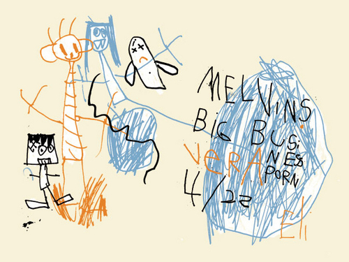
Melvins poster by a 5 year old

MAY 10, 2007
When Dale Flattum was asked to design a tour poster for the Melvins, he hired his son Eli (5 years old) to do the job for him. I dig it.
somewhere in The Netherlands...
permalink | comment
Topical: Seen  

Awards Spam

MARCH 16, 2007
Not sure why, but today I've already received two email spams encouraging me to enter competitions and receive prestigious awards.

....

The first came from the 2007 Create Awards, who have over 300 categories, ranging from illustration to underwater photography. They have awards for just about anything you can think of!

Here's the illustration winner from 2006, which is a 3-D rendering of a living room... Okay!

....

The second spam arrived from The Portfolios.com 2007 Competition, who bill themselves as "the premiere international creative award show", so I suppose that must be true. I must be hopelessly out of the loop on what's hip, because I've never heard of any of the people who won illustration awards from them in 2006.
permalink | comment
Topical: Seen  

Happy Birthday to Drawger

MARCH 12, 2007
Drawger went into beta in February of 2006 with 10 illustrators helping the project and trying to figure out whether something like this might be positive for the good people of the illustration community. The site officially went live on or about March 10th of 2006.

Since then, Drawger has had it's up and downs, no doubt about it. There have been normal growing pains, weathered with good humor and patience by all. When Drawger started looking at the numbers in June, 2006 - the site was attracting around 5,000 visitors a month. The reaction at the time was, "Who the heck are these people and what are they doing here?". At last count, Drawger is close to ten times that, nudging 50,000 visitors every month. I'm still not entirely sure what these people are doing here, but it's nice to know that Drawger is providing the inspiration and connection that was it's original intent.

Drawger has gone on to inspire the upstart, illoz site. Without the ideas and encouragement of the Drawger community, it would have never come to life. I'm so pleased with the results, I don't even have words for it.

I'd like to thank everyone who participates at Drawger. It's been a solid year of entertainment, inspiration and outright joy for me, every single day.

And also: Mad props to my partner in code, Josh Carpenter. Without his help, none of this would have been possible.
permalink | comment
Topical: At Drawger  

Illustration at AIGA

FEBRUARY 22, 2007
Just in case it's not hit your radar yet, the AIGA has a blog devoted to illustration, moderated by Christoph Niemann Here's the AIGA intro: "Illustration lies in a no man's land, somewhere between fine art and clip art. Though illustration remains a powerful and versatile communication tool, it often plays a lonely role in the graphic arts. Illustrators operate from isolated studios, ignorant of the concerns of designers, who in turn are oblivious to the needs of illustrators. Design Forum: Illustration is an online forum built to bridge the gap between these two worlds. It's a place for criticism, commentary, and dialogue between illustrators and designers, to explore the evolving role illustration plays in today's publishing environment." Hook up to it
permalink | comment
Topical: Seen  

Artists and related workers

FEBRUARY 21, 2007
The U.S. Department of Labor doesn't seem to know what illustrators actually do, so why should anyone else?

"Artists generally fall into one of four categories. Art directors formulate design concepts and presentation approaches for visual communications media. Craft artists create or reproduce handmade objects for sale or exhibition. Fine artists, including painters, sculptors, and illustrators create original artwork, using a variety of media and techniques. Multi-media artists and animators create special effects, animation, or other visual images on film, on video, or with computers or other electronic media."


"Illustrators typically create pictures for books, magazines, and other publications and for commercial products such as textiles, wrapping paper, stationery, greeting cards, and calendars. Increasingly, illustrators are working in digital format, preparing work directly on a computer."

Read the Department of Labor frame of reference right here.
permalink | comment
Topical: Seen  

Call for Slogans

FEBRUARY 12, 2007
The Communications Arts 48th Annual Juried Illustration Competition uses the tag line "The Most Prestigious Illustration Competition in the World" in their print matter, both front, back and inside. On the web, they back off a bit, saying it's just the "most important". In a world where words can actually gain market and attention, chest thumping with "the largest", "the best", "the most remarkable" starts to feel as intrusive and dishonest as spam. We're smarter than that, but apparently CA doesn't think so. What slogans like that are supposed to accomplish is provide some price insulation for the advertiser and boost my ego if I decide to buy. It does neither and with the word "communication" front and center, you have to wonder who exactly they think they're communicating with.
 
permalink | comment
Topical: Seen  

The Gift of Klezmer

FEBRUARY 8, 2007
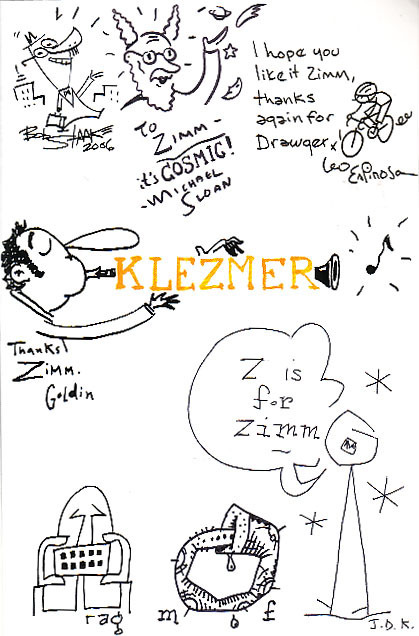
Inside cover of the book
What started here from Leo Espinosa on September 30th of last year, landed with huge surprise in my mail box today. I am overwhelmed and so grateful for this gift, from my friends here. Since none of the group saw this collectively, I thought I'd let you have a look at how the end pages of Klezmer turned out. It is a treasure. Honestly - I don't have any words for this, which is pretty darn unusual for me.
inside back
This wonderful print from Leo has been brought low by my cheap scanner but it is going to the frame shop tomorrow! What a beauty...
Extra Goodies were enclosed. Many, many thanks for this gift from all of you! Still speachless.
permalink | comment
Topical: At Drawger  

Yo Picture Mechanics!

JANUARY 22, 2007

Picture Mechanics was probably the first exclusive cyber port on the web for illustrators. It sort of sat there for a couple of years, in a state of virtual hibernation. But the site has woken up from a long sleep...

"What started out as a simple portal link to each artist's web site blossomed into a creative consortium and collectible products."

... Um...I'm not too sure about the "about" statement, but who reads that stuff anyway? It's now officially a blog and as such, more power to the good people! Should be cool to watch.

Picture Mechanics

permalink | comment
Topical: Seen  

Politics and the profession

JANUARY 21, 2007

Drawger recently got a boost in traffic from the right-leaning blog, Little Green Football. Why did the LGF traffic arrive to wander around here? Basically, to bolster their commonly-held view that artists and illustrators, in particular, are afflicted with a severe case of Bush Derangement Syndrome (BDS for short). Drawger is singled out by LGF contributors as a case study in examining the disease as it manifests itself in the arts.

The topic in which Drawger came up? An article on the much-debated Call For Entries poster  from the Art Directors Club. LGF's view on the poster? It's supporting evidence that the artistic community damages the USA with a self-loathing liberal agenda. The unquestioned conclusion over at LFG is not so much that the artistic merits of the poster are highly suspect, but that it's content provides conclusive evidence of an out-of-step artist intelligentsia, bent on doing harm our nation.

Within the many comments, "...the makers of images are solidly opposed to the US war effort", fairly well summed up the unified view. "Artists who would be doing posters and other images if this were WWII are today solidly on the other side", was a quote that also got some attention.

It's informative to know how the graphic arts community is perceived in these divisive times. Clearly, the illustration community is perceived (rightly or wrongly) as an active ingredient of the far-left.

Illustrators themselves may see this differently. The profession is largely a "gun for hire" racket, after all. A professional may find themselves working for EXXON one day and SAVE THE FURRY SEALS the next. How an illustrator thinks politically rarely has much to do with paying the bills and taxes.

From an outsiders point of view however, this is clearly not the popular consensus. The left largely embraces the graphics community as their own, while the right generally views the entire enterprise as highly suspect and at the very least, not contributing to solutions.

Is this worth thinking about? LGF clearly has a political agenda that is narrow and not particularly inclusive, or tolerant of dissent. They are not the issue. The widely held perception of the graphics profession on both the left and right is an issue that might need some attention, however, if the profession is to be trusted by all.


 

permalink | comment
Topical: Seen