ZIMM
Seen

The Museum of Forgotten Art Supplies

NOVEMBER 10, 2011

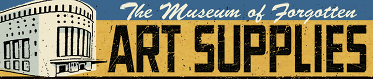
Once hosted here at Drawger, Lou Brooks (with a bit of help from me doing some weekend and after-hours programming) has brought The Museum of Forgotten Art Supplies back!

Do the right thing: Here it is

permalink | comment
Topical: Props  Whatever  Seen  

My CMYK Birthday Present

MARCH 18, 2011

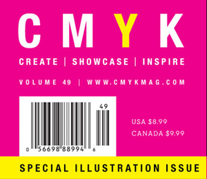
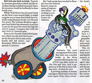
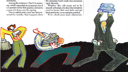
March 7th, CMYK Magazine #49 went to newstands as some sort cruel birthday gift for me. The editors decided to subject their readers to illustrations (if you can even call them that) I happened to have banged out when I was still doodling for dollars, back in the before-time, before the continents had drifted apart, before the ice receeded to the poles. Without my permission, even. Imagine that. 'Oh, here's a hack job that Zimm did for Mountain Dew that was obviously done under extreme duress because he simply needed some cash and didn't care where it came from. Let's print that! Wait, wait, here's a stunningly meaningless turd that Zimm did on a hangover for the 'Got Milk' campaign. Print it? Heck yeah! Ask his permission? Why bother!' Imagine the joy in the seeing these reminders of hackery and despair in print once again. Thanks CMYK! I usally hate my birthday anyway!

Where did CMYK find these forlorn relics, these dried-up left-overs from the salad days of illustration (people would buy anything back then, I tell ya)? On my largely forgotten website that even I haven't looked at or updated since the internet was discovered. A cruel reminder to all you people who haven't updated your sites in years. Just keep in mind, somebody might actually publish that crap without even asking!

Backstory: Ronald J. Cala wrote me an email some time back to inquire if I would write something for the magazine. I wrote it, sent it in, decided I  hated it, then asked that it not be published. Well, truth be told, I told Ronald J. that I didn't like what I wrote when I happend upon him at this years' AI Party, so he probably forgot. It's the only thing I remember distinctly from that night, so I know these things happen.

Happily: My article, along with the editors largely mis-informed (who the heck has time to call and get it right these days?) introduction, is sandwiched between articles featuring Scott Bakal and Yuko Shimizo. It was nice seeing my friends, at least!


permalink | comment
Topical: Complaining  Seen  

Working Surfaces Up Close

SEPTEMBER 3, 2010

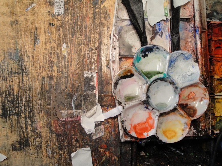
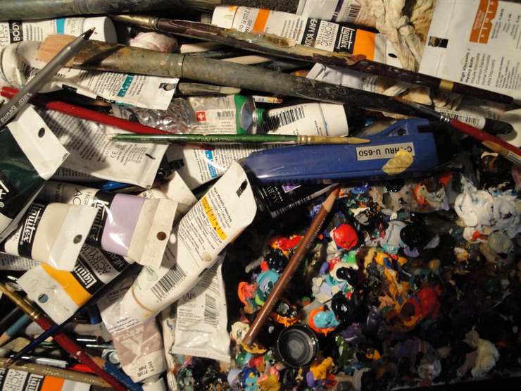
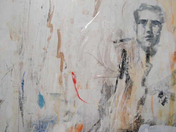
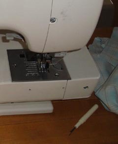
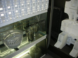
I LOVE work surfaces (where the mysterious magic happens) and was lucky enough to snap a few during a recent trip to NYC. Figured I'd share these, for anybody who feels the same as me. Give it up for the work surface, yo!


Steve Broder's work table above. Forty years of hard labor and mad mad love in grisly detail.


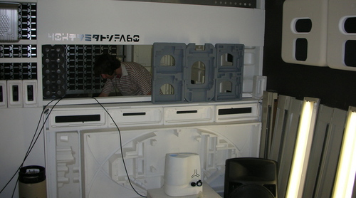
Detail of Brad Holland's chaotic and at the same time serene work area, pictured above.  The piece he was working on at the time (inches away from what you see here) was everything you'd expect from the MAN, and then something more, but you don't get to see that.


Tim O'Brien works standing and as such, his board is as straight-up and verticle as the man himself. Here's a small, yet subline detail of his large working surface at the time of my visit. What else do you want to know? BAM!

permalink | comment
Topical: Seen  Props  

Nancy Stahl Studio Glimpse

AUGUST 27, 2010

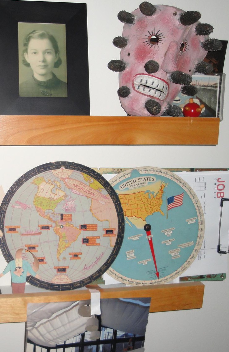
Nancy Stahl invited me to visit her home and studio during a recent trip to New York. I asked if I could take a few snap shots and luckily she didn't mind. Obviously I'm not a professional photographer, but I think these amatuer pics provide a partial glimpse into how this remarkable woman is able to stay vital, current and simply bad ass by surrounding herself with inspiration.


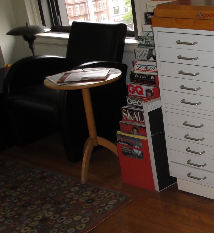
Thanks much for the hospitality, Nancy!

I wonder if I call you if this thing (left) rings. I certainly hope so!

There's no way that I could show everything Nancy surrounds her life with - just a wee little glimpse is all I can show here. Her space is remarkable and I walked away feeling that at every turn of the head, she's challenging herself  to constantly move forward.


permalink | comment
Topical: Seen  Props  

Bite Sized Snack

FEBRUARY 8, 2010
permalink | comment
Topical: Props  Seen  

FAS - George Giusti Lesson

JANUARY 30, 2010

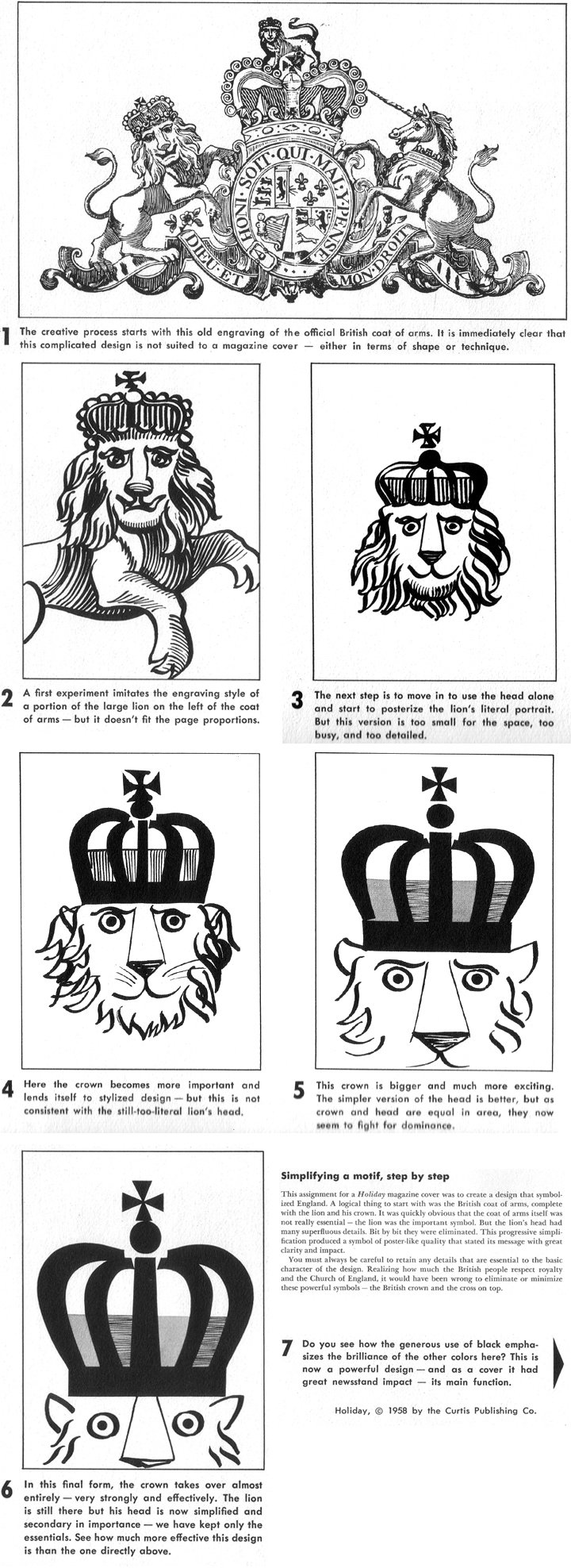
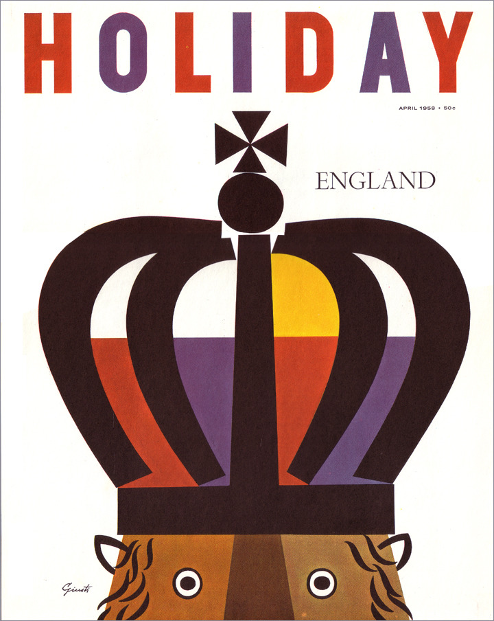
I was on the phone with Enos yesterday and we were chatting about his days at the Famous Artists School. The talk inspired me to rummage around in my garage and pull out some of the course books I've collected from the school. If you've never seen one of these, they are large (14 X12) and impressive items. The ones I have are from 1959.

I haven't thumbed through these in many years, but once I started, these was no stopping. One of the books, blue cover, Lesson 18, titled Principals of Experimental Design contained a lesson designed by the great George Giusti, which I thought I'd share with everyone.
 

Other Giusti Resources:
Covers collected Alexander Budnitz
RIT Library

And I've set up an album for Giusti right here that I'll be adding to!

Also:
The collected stories of Enos at the FAS
 

permalink | comment
Topical: Props  Seen  

Christmas Wish List

DECEMBER 3, 2009

Dear Santa, most things that I actually WANT, I can't have. But isn't that what Christmas is all about ... Not getting what you really want?

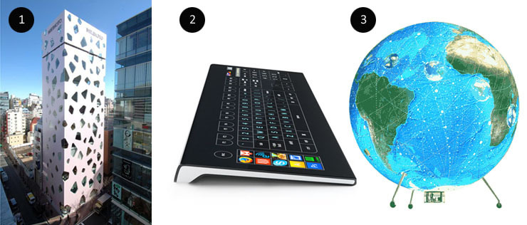
1. I want to go into the MIKIMOTO Ginza2 building in Tokyo, designed by Toyo Ito & Associates, Architects. I would be satisfied just to walk in once and then I would leave, I promise.

2. I want the Optimus Tactus concept Keyboard from Art. Lebedev Studio, designed by Artemy Lebedev. I don't care that this hasn't actually been produced, I want it and yes I deserve it. Yes, this is the second year in a row that I have asked for this but I'm NOT giving up!

3. The Air Genie is a spherical, full-color video-surfaced, helium airship designed by Tom Shannon. Like a lot of things I want, this doesn't actually exist yet. I want it anyway, and I want it as soon as possible. The idea of flying around and projecting whatever I want on the surface of my airship, it's just exactly the thing I want to do.

4. The Lilypad, a floating ecopolis for climate refugees is a concept city designed by Vincent Callebaut Architectures, Hong Kong. It doesn't exist, but who cares? I want to live there anyway. Who the heck doesn't? Come on Santa! Floating cities are cool!

5. The CH4 Wall Decal by Cody Hudson for Bodega is one of those impulse items I know I'll regret later but I can't help it, I want it anyway. Maybe it's just the idea of art you stick to your wall that appeals to me. I wanna do it! I could always peel it off when I get tired of it, right?

6. The MIT 6-D ImageSystem. I asked for this last year from the Santa at Macy's, so I think he's a phoney. I want this and I've been a very good boy THIS year. Please, please, please let me HAVE ONE!

7. Can Steven Heller simply have a legit RSS feed for his Daily Heller column at Print? I'd like to have his feed in my daily news without having to check the Print Site all the time to read what he's going on about...Santa can make this happen, I just know it, it's a no-brainer!

8. I wanna be Randall Enos for ONE DAY. I understand this may be unreasonable, because he values his own body, but I PROMISE to return it (his body) after 24 hours. Image pulled from The Mocha Dick Project.

permalink | comment
Topical: Seen  Props  

Ohger - For Students

NOVEMBER 1, 2009

  Did this finally after many stops and starts: Ohger, a site for students and recent grads in illustration.

  What happened: I've been wondering for two years solid whether I could (or even should) do something for students of illustration, to help them find out who each other are, provide them with a site where they can learn about best practices from professionals and quite possibly get exposed to a few art directors along the way.

   Pacing back and forth on the idea, that's what I've been doing. "Yes I should do it!", "No way you dope, it's a really really lousy idea!", "Yes indeed, I must make this happen if I can!", "Get a freakin' grip dude, it's the lamest idea since melba toast."

  I finally stopped pacing and struck a semi-heroic pose in the mirror. Said,  Yes, " I need to make this happen if I possibly can"

  Why oh why: If illustration hasn't yet crossed the border into the Wild West, where the rules no longer apply and the law is nowhere to be found East or West of the Pecos, it looks to me like that unhappy horizon is rapidly approaching.

  Free is becoming the new normal. 

  Sure thing, most working professionals delivered a free piece of art when they were fresh out of school, in exchange for dubious exposure. Perhaps they did a piece for chump change to get a client listing as well. Today, those opportunities are much more pervasive and abundent  enough to start looking like free is gearing up as the new normal. What are the newcomers supposed to do, except to hopefully band together if they can and take a stand? I'm hoping Ohger will be a buttress in that defense.

  I figure that if illustration (which is the only thing I actually like besides kids playing baseball) is going to hold some ground, I can at least help get these students talking in one place if I can. Hopefully the pros will stop in to offer encouragement as well.

  OHGER.COM - for students of illustration and recent grads (one year out only). Hit me!

   Like everything else I try to help with, it may well be dashed to bits on the rocks below. If that's the case, so be it. I'm giving the idea time and effort  now and at the very least I don't have to pace around any more thinking about it.


permalink | comment
Topical: Props  Seen  At Drawger  

All the Art That's Fit to Print

NOVEMBER 3, 2008

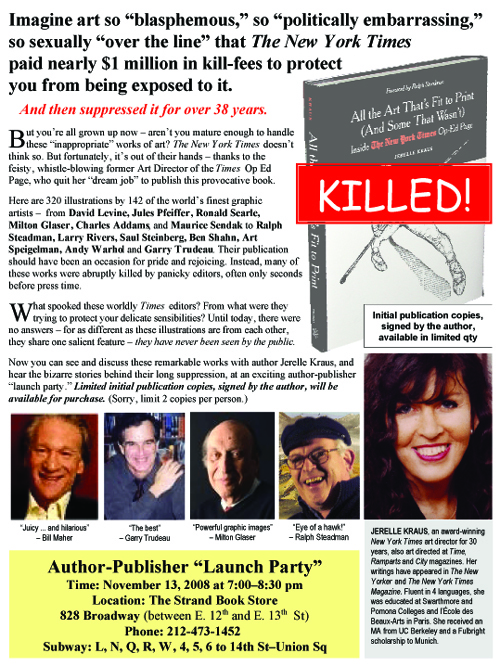
 In 2004, Jesse Sunnenblick interviewed Jerelle Kraus for The Columbia Journalism Review. When I read the article, I thought to myself: There's a book here! In fact, I thought: There's one heck of a GREAT book here!... Little did I know, the book was already well underway.
Four years later, the lucky folks who attended ICON 08 got a small taste of that book, dished out from Jerelle herself.
Now  you can bite into the whole thing.
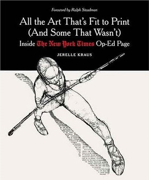
All the Art That's Fit to Print (And Some That Wasn't): Inside The New York Times Op-Ed Page, by Jerelle Kraus
Stepping boldly out on a limb here: This may well be the most important book ever written on the subject of editorial illustration to date. It's a chronicle of where ediorial illustration has been, how it got to where it is today and shines a bright light on where it should go from here. But don't just trust me, the esteemed (is he a Knight yet?) Ronald Searle said it's "Certain to become the illustrator’s bible". Everybody's in it - recognize any of these names?
In or around NYC? Attend the book party at the Strand, November 13th. She'll sign a book for you! Buy one for a friend. Buy one for your least-favorite art director. Buy two for you favorite art director, for sure!
Not around NYC? - Buy it online
Oh and - Jerelle has agreed to do an interview with me over at illoz, so look for that coming soonish. Should be fun!
 

permalink | comment
Topical: Props  Seen  

The illoz Angels

SEPTEMBER 2, 2008
Meet the illoz Angels!

This is a team of 8, 9 and 10 year olds playing this fall in Western North Carolina, corporate home of illoz.com.

Western North Carolina Fall Baseball is a BIG DEAL around these parts and I thought "what the hey...", if a $325 sponsorship will guarantee that a bunch of kids can get dirty and hit some balls, then we're in! Right?

Today was opening day for the Angels.  I was so excited I could hardly contain myself. Seeing them take the field in those little illoz shirts....I can not EVEN begin to describe the excitment of it. I wish everyone could have seen it like I did.

Our illoz Angels went up against the highly favored Astros and came away with a narrow defeat, backed by solid defense and swift base running. When the game was over, team drinks were immediately poured down each other's necks and they went and played in the creek, the narrow defeat forgotten ... immediately.

Ah, to be a kid again...
When you look at kids like this...how can you POSSIBLY not want to help them play ball?

Glad that illoz had a few bucks left over (thanks so much to everyone involved) to make this happen for the Angels. They are one chill team of characters.

Great parents too! As the illoz Angels slipped in the 4th inning to hand over the game to the Astros, parents calmly chattted amoung themselves about how hard the team was trying and how the next game might be better. Parents make a huge difference in youth baseball and the Angel's parents made it all good in the end, the way it should be.
The Angel's dugout was really the place to be. These kids hung the fence every minute and chewed a lot of gum.
Thanks to Coach Yohon Whitaker and his assistant, Ronald Blackman. I happened to snap this pic of them while they were making out their lineup and not exactly sure if they were all that happy about me wandering around on their field at the time...Like I said I was a bit excited, perhaps a bit too excited.

These guys really do have the best interests of the kids in mind at all times and I'm SO PROUD to be able to help them field a team this fall, with the help of everyone involved with the illoz project.

Vintage Commercials

DECEMBER 21, 2007
Citgo Commercial
I had a job sweeping the floors at WSOC TV in Charlotte, NC in 1972. One day a guy handed me a huge box of commercials on 16mm tape that were on their way to the trash-bin. He gave them to me because I was "an art guy" (at age 13), and would somehow "know what to do with them one day" or, so he insisted at the time.

I carried around that box of commercials for almost 40 years storing them in hot attics and damp basements along the way. Last year, I found somebody to digitize them.
Talking Crissy
Even though these vintage commercials have faded and sadly lost a lot of color with the passing of time, I've decided to share them with everyone, regardless. Some of them are simply gems.

The whole project is here at YouTube.
Some of my personal favorites

The Car Man - Citgo Commercial
This one is just a pure classic from start to finish. I wonder who that girl is. There is another in the same series here.

Talking Crissy Doll
This commercial might be one of the creepiest things I've ever seen. One of the girls who starred in this actually wrote to me and said she thought it was creepy too.

 M&M's - Go Fish
 This one is just great television. I kinda wish there were more commercials like this.

GumBall Banks
"Thanks for the GumBall!"

Country Club Malt Liquor
They could never make a commercial like this today. Features a room full of drunks drinking a lot of beer. I love it.

 Del Monte Gel Cup
This commercial is perfect. The timing, the kid, everything.

Belly Button Baby
This means something and I'm not sure I want to know what it is. If you figure it out, keep it to yourself.

Close N'Play by Kenner
I can watch this over and over again.

--------
permalink | comment
Topical: Seen  

illo to web VER. 1.0

JULY 28, 2007
If Business Week is right and the days of the print edition of the San Francisco Chronicle are numbered, it probably means that a lot of other major regional dailies will fall right behind them.

If it's an inevitable truth that the daily news we read will soon only be found behind the smudged screens of our iphones and laptops, it might be time to start wondering how illustration follows along.

So far, no one seems to have figured this out, at least not in a way that makes much sense.

Here's an example of The Chronicle using a Joseph Fielder illustration, taken from print and brutalized with extreme prejudice for the web edition. If you miss it, don't feel bad. It's only 64 pixels wide. You can get a bigger view by clicking on the little fellow. I wonder how many people bother?

The segway from print to web isn't going so well for illustration and if you deal with web code at all, you will have a fairly good idea why this is so. It's just a hard design nut to crack, if it is crackable at all.

Some news outfits do make an effort. The New YorkTimes makes the case for illustration here with a John Hersey spot, handled as well as probably can be done. ( You may have to SIGN UP to view it )

What this sort of thing means to the art directors at the Times is that the days of designing around illustration, which the Times always handled to great effect, are over. The web likes rectangles. Wrapping type can be done on the web, but it's tedious and rarely worth the effort. Design looses out to the grim realities of HTML. Perhaps illustration does as well.
permalink | comment
Topical: Seen  

illoz interviews

JUNE 19, 2007
permalink | comment
Topical: Seen  

Melvins poster by a 5 year old

MAY 10, 2007
When Dale Flattum was asked to design a tour poster for the Melvins, he hired his son Eli (5 years old) to do the job for him. I dig it.
somewhere in The Netherlands...
permalink | comment
Topical: Seen  

Awards Spam

MARCH 16, 2007
Not sure why, but today I've already received two email spams encouraging me to enter competitions and receive prestigious awards.

....

The first came from the 2007 Create Awards, who have over 300 categories, ranging from illustration to underwater photography. They have awards for just about anything you can think of!

Here's the illustration winner from 2006, which is a 3-D rendering of a living room... Okay!

....

The second spam arrived from The Portfolios.com 2007 Competition, who bill themselves as "the premiere international creative award show", so I suppose that must be true. I must be hopelessly out of the loop on what's hip, because I've never heard of any of the people who won illustration awards from them in 2006.
permalink | comment
Topical: Seen  

Illustration at AIGA

FEBRUARY 22, 2007
Just in case it's not hit your radar yet, the AIGA has a blog devoted to illustration, moderated by Christoph Niemann Here's the AIGA intro: "Illustration lies in a no man's land, somewhere between fine art and clip art. Though illustration remains a powerful and versatile communication tool, it often plays a lonely role in the graphic arts. Illustrators operate from isolated studios, ignorant of the concerns of designers, who in turn are oblivious to the needs of illustrators. Design Forum: Illustration is an online forum built to bridge the gap between these two worlds. It's a place for criticism, commentary, and dialogue between illustrators and designers, to explore the evolving role illustration plays in today's publishing environment." Hook up to it
permalink | comment
Topical: Seen  

Artists and related workers

FEBRUARY 21, 2007
The U.S. Department of Labor doesn't seem to know what illustrators actually do, so why should anyone else?

"Artists generally fall into one of four categories. Art directors formulate design concepts and presentation approaches for visual communications media. Craft artists create or reproduce handmade objects for sale or exhibition. Fine artists, including painters, sculptors, and illustrators create original artwork, using a variety of media and techniques. Multi-media artists and animators create special effects, animation, or other visual images on film, on video, or with computers or other electronic media."


"Illustrators typically create pictures for books, magazines, and other publications and for commercial products such as textiles, wrapping paper, stationery, greeting cards, and calendars. Increasingly, illustrators are working in digital format, preparing work directly on a computer."

Read the Department of Labor frame of reference right here.
permalink | comment
Topical: Seen  

Call for Slogans

FEBRUARY 12, 2007
The Communications Arts 48th Annual Juried Illustration Competition uses the tag line "The Most Prestigious Illustration Competition in the World" in their print matter, both front, back and inside. On the web, they back off a bit, saying it's just the "most important". In a world where words can actually gain market and attention, chest thumping with "the largest", "the best", "the most remarkable" starts to feel as intrusive and dishonest as spam. We're smarter than that, but apparently CA doesn't think so. What slogans like that are supposed to accomplish is provide some price insulation for the advertiser and boost my ego if I decide to buy. It does neither and with the word "communication" front and center, you have to wonder who exactly they think they're communicating with.
 
permalink | comment
Topical: Seen  

Yo Picture Mechanics!

JANUARY 22, 2007

Picture Mechanics was probably the first exclusive cyber port on the web for illustrators. It sort of sat there for a couple of years, in a state of virtual hibernation. But the site has woken up from a long sleep...

"What started out as a simple portal link to each artist's web site blossomed into a creative consortium and collectible products."

... Um...I'm not too sure about the "about" statement, but who reads that stuff anyway? It's now officially a blog and as such, more power to the good people! Should be cool to watch.

Picture Mechanics

permalink | comment
Topical: Seen  

Politics and the profession

JANUARY 21, 2007

Drawger recently got a boost in traffic from the right-leaning blog, Little Green Football. Why did the LGF traffic arrive to wander around here? Basically, to bolster their commonly-held view that artists and illustrators, in particular, are afflicted with a severe case of Bush Derangement Syndrome (BDS for short). Drawger is singled out by LGF contributors as a case study in examining the disease as it manifests itself in the arts.

The topic in which Drawger came up? An article on the much-debated Call For Entries poster  from the Art Directors Club. LGF's view on the poster? It's supporting evidence that the artistic community damages the USA with a self-loathing liberal agenda. The unquestioned conclusion over at LFG is not so much that the artistic merits of the poster are highly suspect, but that it's content provides conclusive evidence of an out-of-step artist intelligentsia, bent on doing harm our nation.

Within the many comments, "...the makers of images are solidly opposed to the US war effort", fairly well summed up the unified view. "Artists who would be doing posters and other images if this were WWII are today solidly on the other side", was a quote that also got some attention.

It's informative to know how the graphic arts community is perceived in these divisive times. Clearly, the illustration community is perceived (rightly or wrongly) as an active ingredient of the far-left.

Illustrators themselves may see this differently. The profession is largely a "gun for hire" racket, after all. A professional may find themselves working for EXXON one day and SAVE THE FURRY SEALS the next. How an illustrator thinks politically rarely has much to do with paying the bills and taxes.

From an outsiders point of view however, this is clearly not the popular consensus. The left largely embraces the graphics community as their own, while the right generally views the entire enterprise as highly suspect and at the very least, not contributing to solutions.

Is this worth thinking about? LGF clearly has a political agenda that is narrow and not particularly inclusive, or tolerant of dissent. They are not the issue. The widely held perception of the graphics profession on both the left and right is an issue that might need some attention, however, if the profession is to be trusted by all.


permalink | comment
Topical: Seen  

Renaissance stock

DECEMBER 13, 2006
Detail from USN Cover by Raphaello Sanzio
When religion hits mainstream newsstands, you can usually count on the art department rummaging around in the Italian High Renaissance stock to fill space. This weeks cover of US News & World Report is no exception and treats readers to a high quality reproduction of Raphael's (Raphaello Sanzio) Sistine Madonna, to match up with a controversial article on The Real Jesus. Inside, the cover article is "illustrated" by Agnolo Bronzino (1503 72), Peter Paul Rubens (1577-1640, Baroque) and the always popular, Pietro Perugino (1445-1523). This is a safe editorial decision. An illustrator who's been dead 500 years isn't likely to cause much controversy. And, it's safe to say that an article, teamed up with irreproachable art, gains credibility by proximity, even though the substance might be hot-button and largely conjectural. So sure, it's a good mix: Classic art and controversial religious editorial content. But at the end of the day, sad and perhaps even wimpy. Had USN decided to hire a living artist, imagine how much more public involvement could have been created - both for USN and the artist themselves. The result would be talking points in the broader media that referenced the core ideas of the article, with contemporary visuals that added to the conversation. Instead, the brass at USN run for cover and we get illustrations by esteemed artists from history, and bold editorial content that simply hides behind them.
permalink | comment
Topical: Seen  

USN - Illo Watch

NOVEMBER 21, 2006
Everybody needs to make a living. Some people make a living as an illustrator. Still others make a living illustrating like other illustrators. Chris Gash is just such a fellow, making a living illustrating in the same style as the well established illustrator, Mark Matcho. People who watch illustration (there are probably a dozen or so) are well-aware of Matcho and also most likely aware that Gash does Matcho pretty well. Not a big deal, really. It happens in all walks of life. Copying someone who's popular to make your way in life, it's bound to happen. What normally happens with illustrators who make a living by working in the style of a popular illustrator, is that they work along the fringes of publishing. They work the small magazines, much like a Kiss cover band gets to play the local clubs, but not much more. But, when an internationally recognized and well respected magazine like US News & World Report decides to hire Gash for a multi-page, three spot story (November 27, 2006 issue - pages 67-74), it might give the hard working professionals, who've staked a lot of time and money on refining and promoting their unique style, a bit of pause. The Kiss cover band is suddenly playing Madison Square Garden. What’s happened here? No doubt about it, the excellent art directors (and they are excellent) at USN have known about Matcho for years. The man promotes himself well. He's been at the drawing board for almost twenty years now. And, also without a doubt, the art department of USN is aware that Gash is lifting the stylistic chops of Matcho to make a living. Anyone with an eye for art can spot the alarming similarities without effort. So, let me ask a question. If Matcho is Kiss, and Gash is the cover band, and US News really is Madison Square Garden, hasn’t everybody that bought a ticket just gotten ripped off? The sad conclusion that I reluctantly arrive at is that USN simply doesn't care that much. The public won’t know the difference, unless they’re sitting on the front row like myself. It looks like Kiss from the cheap seats. Who cares? Right? Well, I for one want my money back. Mark Matcho - Chris Gash
permalink | comment
Topical: Seen  

USN - Enos Watch

OCTOBER 17, 2006
Enos - dah mahn!
The October 23, 2006 issue of US News & World report sports some fine Randall Enos. The work is a real standout for the magazine, lately. Since the departure of former art director, Rob Covey ( went to Discovery), US News has been steadily dropping illustration as a mainstay of it's content. Hal Mayforth, long-time USN reliable has been missed for some time now, with Barry Blitt seemingly the sole survivor of the illustration crack-down. It's common for many issues of USN to pass by without a single feature illustration, which is sad for a magazine that formerly used illustrators to great effect. I think part of that may be caused by the loss of Covey, who honestly loved illustration and illustrators. He hung framed originals in his office.
All rights preserved in formaldehyde by Randall Enos
The Enos work makes the issue come alive and takes what would be a fairly droll article on a slowdown in investing to giddy heights of fun. Hey, that's the job, right? Randall seems to do a bit more, though. After several issues with no featured art, his drawings seem like a wake-up call, chiming in and saying "Hey! Illustration rocks!"
permalink | comment
Topical: Seen  

Marketing Hell

OCTOBER 5, 2006
Lovely, right?
Got an email this morning from an old friend, saying they were happy as heck to be coming my way soon and staying in the near-by town of Canton. And why not? Check out the marketing for this apparently lovely little mountain enclave.
This is downtown Canton
The reality? Canton is home to one of North Carolina's largest and most productive paper mills, Blue Ridge Paper. Ever been around paper being made? Not only does it smell REALLY bad for miles in every direction, the pollution output (even though they have dropped in recent yers) for old mills such as Canton's are the stuff of environmentally challenged legend.
permalink | comment
Topical: Seen  

The Playoff Sign

OCTOBER 3, 2006
© New York City Department of Transportaion
The sign was stolen (using bolt cutters) from the Cross Bronx Expressway in 1987 and has gone up in front of my house every year since 1991 that the Yankees have gone into the playoffs. Yes - I have been seen tearing it out of the ground at midnight and dragging it back into the garage on several occassions... Does the NY DOT read Drawger? Yo - it was ME, and now you know where I live! Go Yanks!
permalink | comment
Topical: Seen  

Foladable Subway Cars

AUGUST 30, 2006
permalink | comment
Topical: Seen  

Drawger in the news

AUGUST 17, 2006
A nice write up by Bill Russel at The Northern California Graphic Artists Guild web site, where Adam McCauley waxes about Drawger, and offers advice on proper blogging, such as "readers can't detect irony" . Thanks Bill and Ad! I guess the secret is out...

. . . . .
permalink | comment
Topical: Seen  

JD King and the Coachmen - American Mercury

AUGUST 3, 2006
Pkg Design ( for reasons that baffle me) by David Greenberger. Illo © JD King.
The eclectic beat soundscapes of JD King and the Coachmen, American Mercury CD arrived unexpectedly by post recently. The sonic caliopy of the Coachmen, I've since discovered, is best appreciated alone in a car driving on lonely mountain roads at night. Expands the experience to a disarming sound track for life. Thanks JD! Sample the Coachmen
permalink | comment
Topical: Props  Seen  

Frazier's 98

JULY 28, 2006
©2006 Craig Frazier
Late tag-on to theLeo Espinoso note on Craig Frazier's 98 sketch book. Just received an imprint of 98 today in the mail and wanted to send out a "YO DUDE THANKS" to the Craig Man! .... The book is sublime. Should be "mandatory looking" (if there were such a thing) for everyone. . . . . .
permalink | comment
Topical: Props  Seen  

Comic Fine Art by Chris Ware

JULY 23, 2006
Stumbled by complete and happy accident into the Chicago Museum of Contemporary Art where the second floor was dedicated to exhibiting the original comic pages of Chris Ware. Made me immediately think about Roy Lichtenstein - half a century ago, basically recreating comic book panels and having them widely regarded as fine art. Struck me as a bit amusing that it took another half century for actual comic panels to be regarded the same way. Don't know if it was because of the Ware exhibition or not, but the gift shop was awash in contemporary illustrator/artist wares from the likes of Baseman and Biskup. It's probably remarkably uncool, but I've posted a photo gallery of shots taken (mostly) by my son, John Z. during our Chicago trip.
permalink | comment
Topical: Seen  

Mac Packaging Movie Set

JUNE 1, 2006
How about a movie set built entirely with Macintosh packaging materials? Moon Europa delivers on the vision.
Took these photos of the set, with director Chris Bower's permission. Pictured here are the food storage aquariums. (not that aquariums are included in Macintosh packaging that I'm aware of...but hey)
Attended a Moon Europa party in the Mac Packaging spaceship set - here's the DJ. Thought this glimpse might inspire.
permalink | comment
Topical: Seen  

Matcho Watch

MAY 28, 2006
Thankfully, Mark Matcho has finally let us in, to see what he's been doing at his web site all this time. It's a treat.
Includes the sublime Gallery of Rejected sketches (perhaps, the perfect sound score for the theme).
Definately, check out Mark's movies. Mark's promo, My Life as a NewsPaper Man touched me, personaly, but there is lots of other stuff to see as well.
permalink | comment
Topical: Seen  

Bonus mckibillo

MAY 2, 2006
mckibillo
I've been using the above image from Josh McKible's bonus page today as my desktop and I'm now taking it off cause I can't get anything done. Thanks mckibillo but I need to stop staring at my screen all day.
permalink | comment
Topical: Seen  

Moores Watch

MARCH 20, 2006
The above is the address area of a promo recently received from fellow drawger Jeff Moores. This is a printed piece, with my name and address in a font, and then a personalized message, printed in the balloon, using my first name.

This is some seriously cool and extremely effective (in my opinion anyway) direct marketing. Not only is this mailer printed to be customized for ME on the mailing side, but also on the INSIDE where a PRINTED greeting to me appears, which reads "Welcome Robert, to the Cafe Menagerie.

I personally guarantee results....

Super fine.

. . . . .
permalink | comment
Topical: Seen  

The go-to guy for designer toys

MARCH 15, 2006
Klim Kozinevich, a new friend of mine and the throbbing brain atop Big Shot Toy Works, did the sculptural development for this mighty fine Mc Supersized toy for Ron English.

Klim combines some sublime drawing skills with bonifide industrial design chops and his own personal brand of pure whack.

The market for designer toys doesn't seem to be slowing down any time soon - with some top illustrator talent taking full advantage.

Klim came over for my monthly poker night of arty farty folks, but unfortunately didn't bring any money so we couldn't take it from him - but did let me know that it's guys like him with industrial design brains that act as the conduit between art and production, which is good stuff to know, especially if you don't know it in the first place...

. . . . .
permalink | comment
Topical: Seen  

Ringling Museum Pics

MARCH 10, 2006
About two and a half feet high
Here's an early Lou Jacobs clown car from the Ringling Museum in Sarasota Florida.
Too cool for words
Here's a section of the big top area of Howard Tibbals' 3,800 square foot miniature circus (3/4" to the foot).

Ringling Museum

. . . . .
permalink | comment
Topical: Seen  

WI FI POST

MARCH 8, 2006
Yo - wi fi post here from The Atlanta Bread Company in Sarasota Florida. Just left the John and Mable Ringling Museum of Art - where not only is the art collection mind bending but the Museum of old Circus stuff is insane! I'll post pics when I get back. In the meantime, here's a really lame virtual tour of where I just was.

. . . . .
permalink | comment
Topical: Seen  

Illo Watch

FEBRUARY 23, 2006
While flying the friendly skies of United yesterday, I noted that the cover of Hemisphere's Magazine gave not only credit to the talented Mr. Craig Frazier, but also directed readers to his website.

The online version of Hemisphere's does the same, with a handy link, which if clicked on, appears in a framed version of Hemisphere's own website.

Are the folks at United getting into creative cost cutting - the begining of commercial illustration as self-promo - or what?

. . . . .
permalink | comment
Topical: Seen  

Jim Flora

FEBRUARY 17, 2006

I can't stop looking The Mischieveous Art of Jim Flora.

I've had it for about 6 months and I carry it around like some kind of security blanket.

At Amazon

. . . . .
permalink | comment
Topical: Seen  

Russell Tate - Wuz Up?

FEBRUARY 14, 2006
permalink | comment
Topical: Props  Seen  

Kevin Pope starts daily cartoon

FEBRUARY 14, 2006
Kevin Pope is up and running with FishStiks.com and is posting daily humor of the Kevin Pope variety. Worth checking out.
permalink | comment
Topical: Seen